 |
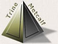
The company logo is based upon a pyramid to represent stability.
For artistic interest, each visible side of the pyramid was decorated with a smaller triangular shape engraved on one side and in relief on the other.
Two light sources (see shadows) represent the two attorneys affiliated with the firm. Addition of the attorneys' names (also the name of the firm) reinforces branding.
|
|
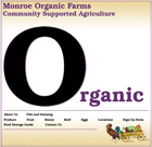
The company logo is the rooster in the bottom right of the page.
A key marketing point is that the farm produce is organic. Therefore, the word Organic is featured and prominent. For a memorable style, the O in Organic is emphasized through the use of an oversized, highly contrasting font color. To pique interest and further reinforce a major marketing point, the O is filled with a different rollover image for each menu item.
|